CLIENT
Co-Operative
ROLE
Head of design
AGENCY
OgilvyOne
YEAR
2014
Co-Operative Bank
The Co-Operative bank’s digital brand and services had long been neglected; a new Head of Digital wanted to address this swiftly after his arrival. The banking group had been hit by a financial crisis so they desperately needed to attract new customers and limit the loss of existing ones - all of this within restrictive timescales and budgets.
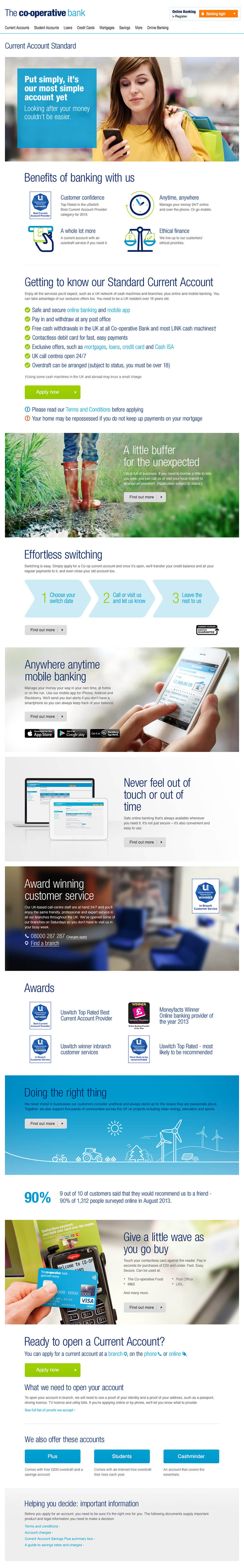
With the Co-Op’s long-established position as an ethical champion, we wanted to portray a friendly customer-centric brand. The design challenge was to communicate efficiently and not burden users with information overload, customers should be able to quickly grasp the primary account benefits.
The brand guidelines covered the entire Co-Operative Group of businesses and were restrictive. Our approach proposed to push the guidelines, introducing new design elements, illustration, and making use of more white space. Fly-on-the-wall photography of everyday people helped depict the company’s entrenched investment in the community.
The result was a website that was approachable and friendly, and communicated ethical values the rest of the UK banks were devoid of.
Role
I was involved right from the start - pitching to the Bank’s Head of Digital and the stakeholders that our agency was up to the task. My role as Head of Design continued through with design direction and covered the tricky task of proposing and negotiating the bending of brand guidelines.
My responsibility was to direct all design aspects of the project including a suite of illustrations and photography (both sourcing and shooting).
Although the project was constrained by budget, time and technical restrictions the website was far fresher than any of the UK banking competitors.
Accounts home
The Accounts homepage simply establishes the primary benefits of the bank with illustration and allows the user to quickly access the various accounts.
Where there is more content, on account pages like Standard Current Account below, we alternated colour, space, and size of modules so the page, providing a clear information hierarchy.
Accounts home page
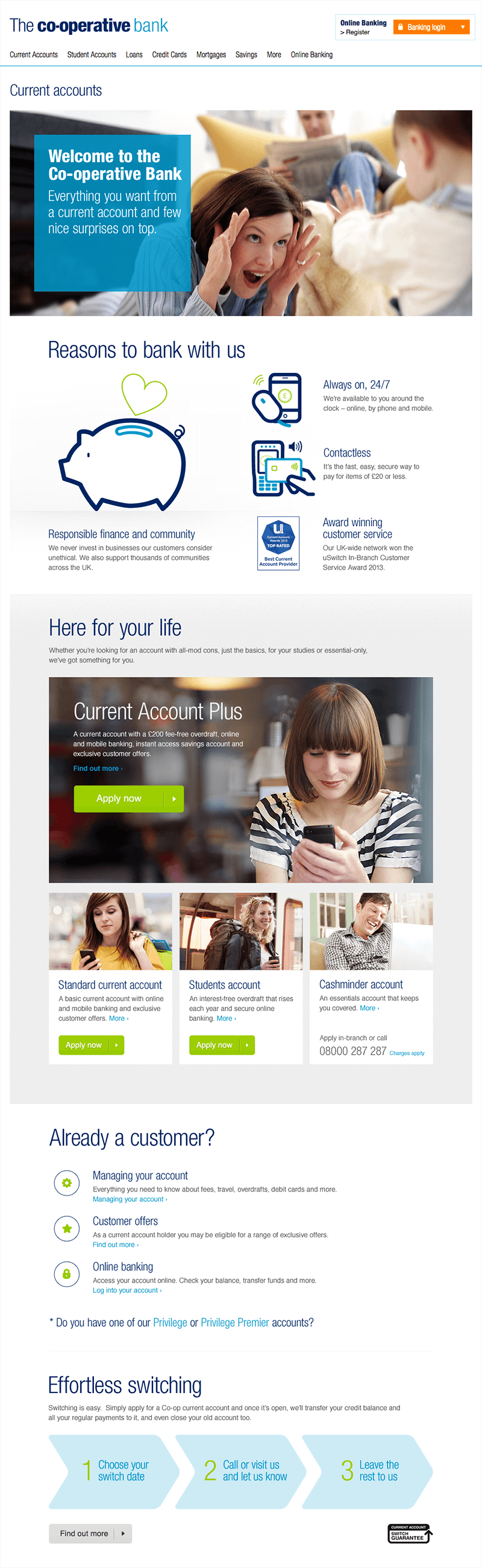
Standard Current Account page
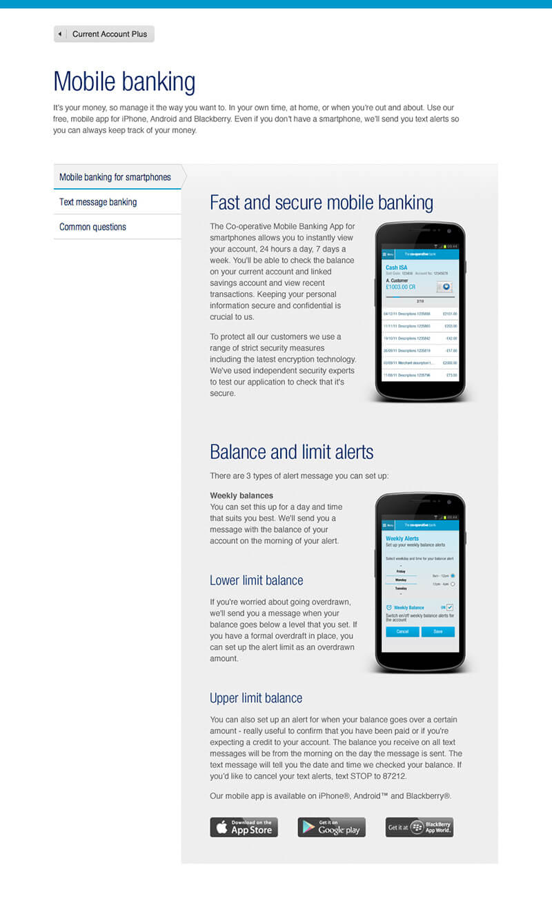
Mobile information page